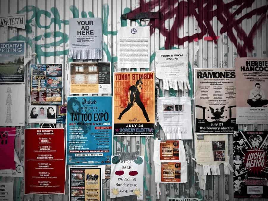
Even though flyers are not as famous as they were a while ago, they are still helpful. In this article, we’ll examine the continued importance of flyer design in your overall marketing and advertising strategy and how to create effective flyers for your company using online design tools.
Flyer design isn’t the first thing that comes to mind when considering design trends in today’s all-digital, always-on world. Flyers are still a powerful tool for spreading the word about your company or event, though only if you know how to make the most of their visual impact.
Here’s how you can make your flyers and ensure they help promote your business.
Let’s dive right in.

Quick Links
What makes a flyer design effective?
Every flyer needs a few specific design components to be effective, such as:
1. An eye-catching heading
When someone looks at your flyer, the headline will be the first thing they will see, so it must stand out and catch their attention.
Create a catchy headline if you want to get people to pay attention. Once you have caught the audience’s attention, there is a higher chance that they will read the entire message. Consider how you can engage readers when writing your headline.
Also Read: 10 Best Apps to Create Flyers for free | Android + iOS (2022)
2. Highlighting correctly
You can’t just cram all the information onto a page and hope for the best if you want your flyer designs to be successful. Your flyer’s layout and the visual hierarchy you establish will help your audience understand what is significant to them and what they should pay attention to.
Generally speaking, the more noticeable a design element is, the more eyes will be drawn to it, and the more likely they will pay attention. So, you should appropriately highlight the important text in bold letters to ensure proper delivery.
3. Find balance
You might feel tempted to write as much information as possible onto the page when designing your flyer. But it’s crucial to resist that urge if you want your flyer design to be effective.
Trying to cram too many elements—text, graphics, images, and colors—into your flyer design is the last thing you want to do. Too many different things on a page won’t just be visually overwhelming; your audience won’t know where to focus their attention, and your message will get lost.
4. Typography matters
The content of your flyer matters. It’s also how you say it, though, that gets the message across fully. The fonts you decide to use in your flyer design will significantly aid in conveying the message of your flyer.
The wrong fonts can confuse your audience, while the right fonts can help reinforce your messaging and drive home your branding. When selecting a font, consider what it might convey to your audience and whether it is consistent with the messaging and branding of the flyer.
Key tip:
Knowing all the elements ensures that your poster will include all the necessary items. Consider already designed templates to make your life easier when you want to create your flyer. You can access a wide range of customizable flyer templates on PosterMyWall.
How to Design a Flyer?
After discussing the essential elements of a flyer, let’s talk more about how to design a great flyer for yourself using online tools.
1. Have one key message only
Trying to communicate too many things about your business, like the CEO or the details of your business, will shift focus from the central message of your flyer, and everything will get jumbled up, making message delivery inaccurate. So, to ensure your point gets across properly, have only one message or aim for your flyer and repeat it a few times for emphasis.
2. Branding
Ensure the branding of your flyer. Consistency is crucial for developing your audience’s trust and brand recognition. Make sure to incorporate all of your branding elements into the design of your flyers, such as your logo, color scheme, and brand fonts, so your audience can quickly connect it to your company. This way, chances are that they will pay attention to your flyer.
3. Consider your audience when creating.
It’s critical to keep your focus on your target audience when designing a flyer if you want it to be successful. Flyer designs that are effective with millennial business owners will be very different from those that significantly impact new parents, retirees who enjoy traveling, or CEOs of unicorn startups. The point is that you must have a distinct understanding of your target audience before designing your flyer.
4. Clearly write the message
The flyers that produce results are the most effective. But if you don’t tell people what you want from them, you’ll never get those results. You must inform your audience what you want them to do, sign up for your email list, attend your event, or stop by your office for a free consultation. Doing so will maximize the effectiveness of your flyer design, and you’ll get the outcomes you want if it has a clear call to action.
Also Read: Blocking Websites in the Workplace – Yay or Nay?
Conclusion
According to the statistics, in the U.S, 40 percent of people reported that posters made them visit a business site, and 24 percent said that they even purchased because of it. Your flyer can only help you achieve the results you’re hoping for if you get the message across properly.
Making flyers is pretty easy, especially when you use an existing template. Hopefully, this article will help you make the best possible flyer.